
Tame Impala: Currents
This was a group project where the goal was to create a product packaging that would be accessible to a target audience that is sometimes overlooked in the packaging world.

This was a group project where the goal was to create a product packaging that would be accessible to a target audience that is sometimes overlooked in the packaging world.

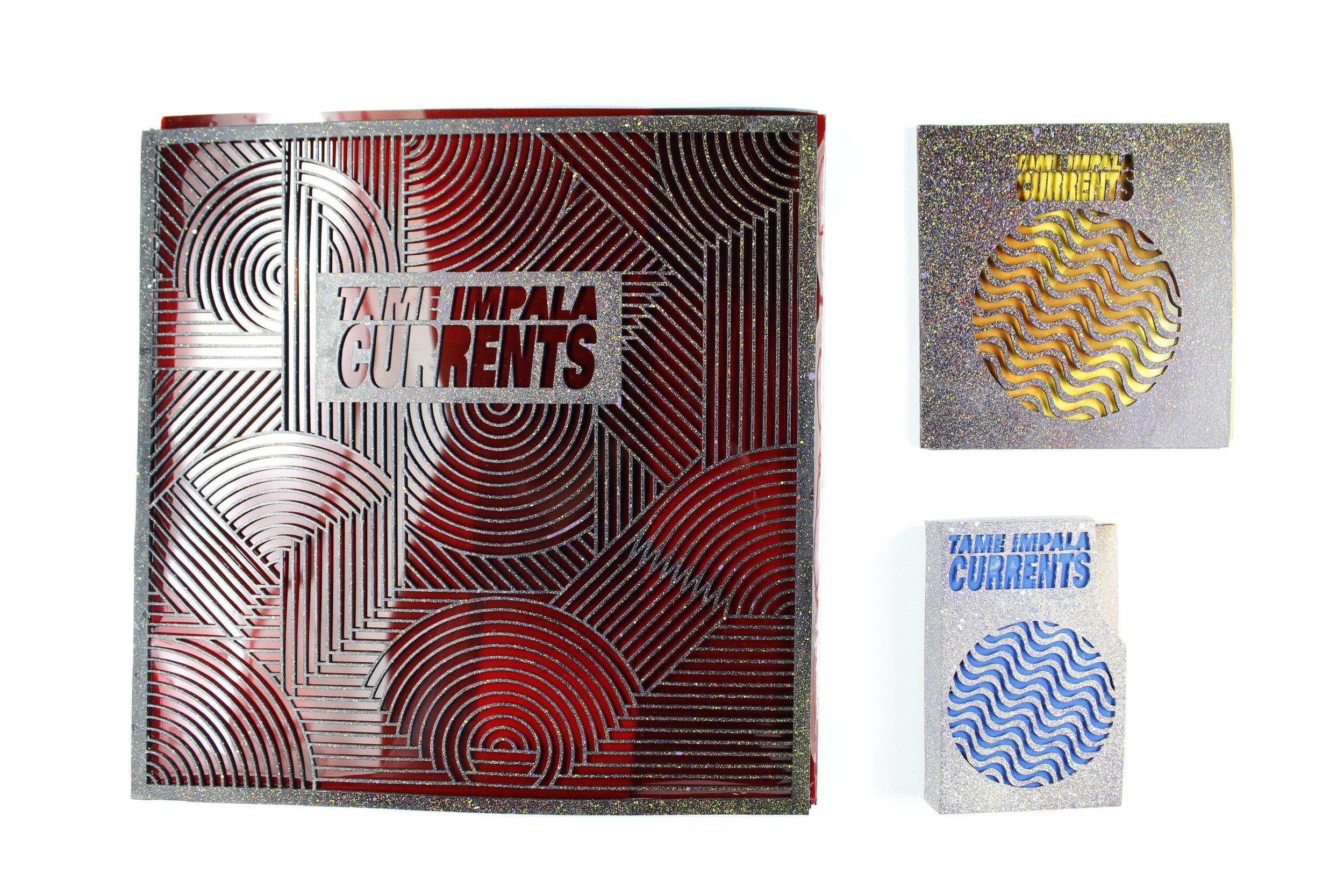
We chose blind or visually impaired people to be the target audience while still making it universally appealing.
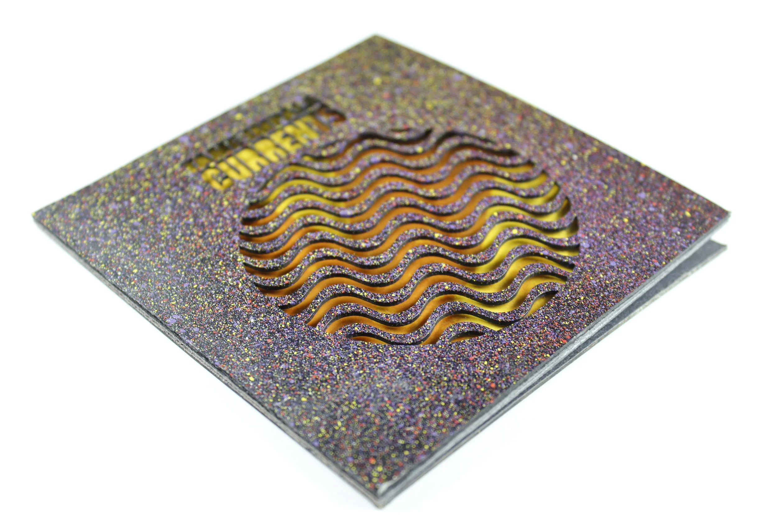
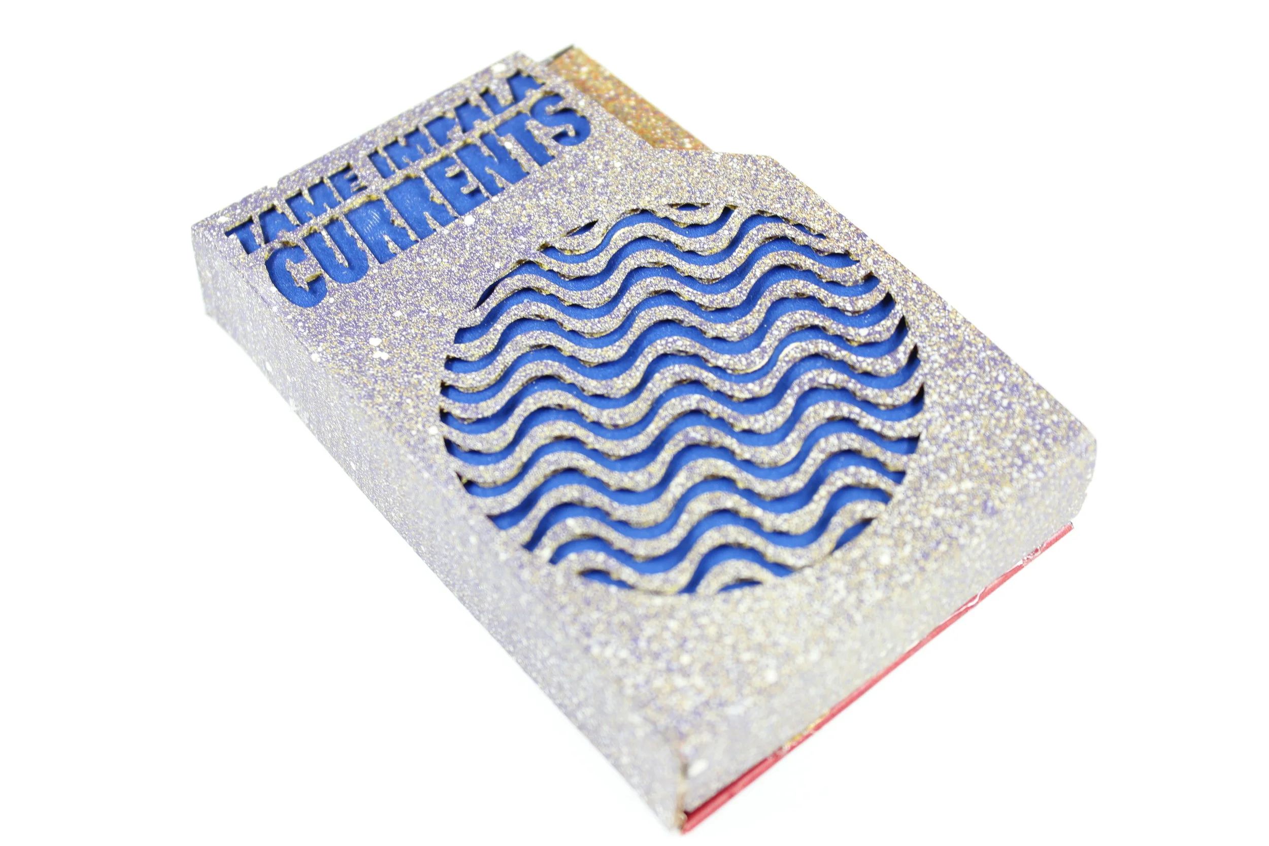
From the record cover to the cassette case, all of the packages include laser cut details and textures that can be traced with fingers and enjoyed by everyone.
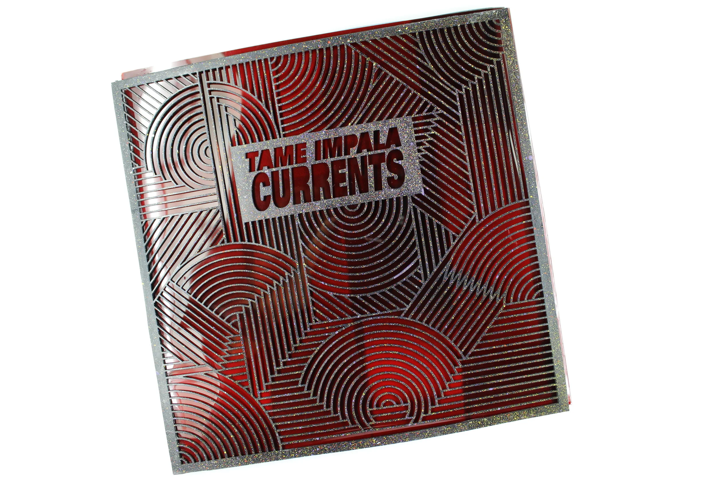
The design for the record cover was actually a doodle I had done in my sketchbook months earlier. When flipping open my book while working on this project my partner and I felt that this design fit Tame Impala’s brand identity perfectly.
My partner for this project was a fellow graphic designer named Dillon Nusca. We each have extremely different approaches to design but that is what made this project such a pleasure to work on.